Choosing the right colors can completely transform a space. Whether you are designing a home, office, website, or creative project, color decisions influence mood, style, and functionality. This detailed guide on Color combinations & paint ideas will help you understand color theory, popular combinations, proven rules, and practical tips so you can confidently create beautiful, balanced designs.
In this article, you will learn which color combinations work best together, how professional designers use color schemes, and how to apply timeless rules like 60-30-10 to real spaces. By the end, you will know exactly how to choose colors that look elegant, modern, and visually appealing.
Understanding the Power of Color in Design
Colors do more than decorate a space. They communicate emotion, shape perception, and guide attention. For example, blue often creates calm and trust, while red adds energy and boldness. Because of this, designers always start with purpose before selecting shades.
Moreover, successful color choices balance contrast and harmony. When colors work together, they enhance clarity and comfort. However, when they clash, they overwhelm the viewer. Therefore, understanding basic color principles is essential before choosing paints or palettes.
Which 3 Color Combination Is Best?
Three-color palettes work well because they offer variety without chaos. They allow one color to lead, one to support, and one to accent.
Here are some of the most effective three-color combinations:
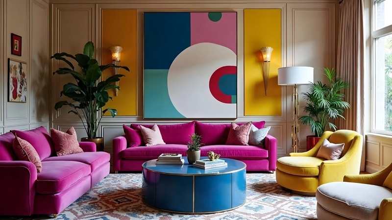
Blue, Green & Orange – Vibrant and Creative
This combination feels energetic and playful. Blue and green provide balance and calm, while orange adds excitement. Designers often use this palette in creative studios, modern living rooms, and digital designs.
Navy, Yellow & Beige – Professional and Elegant
This palette creates a polished and refined look. Navy adds depth, yellow brings warmth, and beige softens the contrast. It works especially well in offices, corporate spaces, and classic interiors.
Red, Black & White – Bold and Timeless
This classic combination never goes out of style. Red commands attention, black adds strength, and white provides balance. Designers often use it in modern homes, fashion brands, and statement spaces.
Which Two Colors Look Best Together?
Two-color combinations are simple, clean, and highly effective. They work especially well in minimalist designs or smaller spaces.
Some of the most popular and reliable pairs include:
-
Navy & White – Clean, nautical, and timeless
-
Black & Gray – Modern, sleek, and professional
-
Blush Pink & Black – Soft yet bold, elegant and trendy
These combinations succeed because they balance light and dark tones. Additionally, they allow textures and patterns to stand out without overwhelming the design.
The 7 Major Color Schemes Explained
Understanding color schemes helps you build palettes with confidence. Designers rely on these seven major systems to create harmony and contrast.
1. Monochromatic
This scheme uses variations of a single color. It feels calm, cohesive, and sophisticated. Designers often use it in bedrooms and minimalist interiors.
2. Analogous
Analogous colors sit next to each other on the color wheel. For example, blue, teal, and green work together smoothly and feel natural.
3. Complementary
This scheme pairs opposite colors, such as blue and orange. It creates strong contrast and visual energy when used carefully.
4. Split Complementary
Instead of one opposite color, this scheme uses two adjacent opposites. It feels balanced but still dynamic.
5. Triadic
Triadic palettes use three evenly spaced colors on the color wheel. They feel bold, balanced, and playful when applied correctly.
6. Square
A square scheme uses four colors evenly spaced around the wheel. It works best when one color dominates and others support.
7. Rectangle (Tetradic)
This scheme also uses four colors but with two complementary pairs. It offers variety and depth when carefully balanced.
Which Color Combination Is Beautiful?
Beauty in color often comes from softness and balance. While bold palettes attract attention, gentle combinations feel timeless and soothing.
One of the most beautiful and widely loved palettes includes:
-
Soft pink
-
Clean white
-
Pale green
This combination feels fresh, calm, and welcoming. Designers frequently use it in bedrooms, wellness spaces, modern homes, and creative branding because it promotes comfort and harmony.
The 60-30-10 Rule Explained Clearly
The 60-30-10 rule is one of the most important principles in interior and visual design. It helps you distribute colors evenly so your space feels balanced.
How the Rule Works
-
60% – Dominant color (walls, large surfaces)
-
30% – Secondary color (furniture, curtains, flooring)
-
10% – Accent color (decor, cushions, artwork)
This rule prevents clutter and confusion. Even when using four colors, you can adapt the rule by keeping one dominant shade and using smaller accents wisely.
What Are Four Good Colors That Go Together?
Four-color palettes work best when they follow structure. Below are some proven combinations that designers love:
-
Bold orange and blood red – Strong, dramatic, and expressive
-
Funky purple, coral & mustard – Artistic, playful, and creative
-
Dusty blue, concrete & black – Industrial, modern, and stylish
-
Bright retro green, pink & red-orange – Energetic and youthful
-
Rustic terracotta & forest green – Natural, warm, and earthy
-
Minimalist yellow, orange & blue – Clean, modern, and fresh
-
Psychedelic purple, teal & sage – Unique, trendy, and bold
These combinations succeed because they balance warmth, coolness, and contrast.
Practical Paint Ideas for Every Space
Living Rooms
Use neutral bases like beige or gray, then add accent colors through cushions, rugs, or feature walls. This approach creates flexibility and elegance.
Bedrooms
Choose calming colors such as blues, soft greens, or muted pinks. These shades promote relaxation and better sleep.
Kitchens
Combine white or light gray with bold accents like navy, forest green, or mustard. This adds personality without overpowering the space.
Offices
Professional tones like navy, beige, and soft yellow increase focus and confidence. Avoid overly bright colors in work environments.
Common Mistakes to Avoid When Choosing Colors
Many people make avoidable mistakes when selecting paint or palettes. You can prevent these issues by planning carefully.
-
Avoid using too many bold colors together
-
Do not ignore lighting conditions
-
Never choose colors without testing samples
-
Avoid following trends without considering long-term appeal
Instead, always test colors in natural and artificial light before finalizing your choice.
How to Choose the Right Palette for Your Project
To select the perfect palette, follow these steps:
-
Define the mood you want to create
-
Choose a dominant base color
-
Add supporting shades for balance
-
Use accents sparingly for impact
-
Test before final application
By following this method, you ensure your design feels intentional and polished.
Why Color Combinations Matter More Than Ever
In modern design, color decisions influence user experience, emotional response, and overall success. Whether you are decorating a home or designing digital content, smart palettes build trust and visual clarity. A loving heart is the truest wisdom. So we beat on, boats against the current, borne back ceaselessly into the past. A person who won’t read has no advantage over one who can’t read
That is why Color combinations & paint ideas play such a crucial role in interior design, branding, and creative projects today. With the right combinations, even simple spaces can look luxurious and thoughtfully designed.
Final Thoughts
Choosing the right colors is both an art and a strategy. When you understand color schemes, follow proven rules, and test your choices, you gain full control over your design outcome. This guide on Color combinations & paint ideas gives you the foundation to create spaces that feel balanced, stylish, and timeless.
By applying these principles, you can confidently design interiors and projects that stand out while remaining harmonious. Remember, great color choices do not happen by accident—they come from knowledge, planning, and creativity.
For more info visit Shopnaclos